Pulsator for Flutter
The Pulsator Flutter package brings a captivating pulsating animation to your Flutter applications.
Installation
To integrate the Pulsator package into your Flutter project, add the following dependency to your pubspec.yaml file:
dependencies:
  pulsator: ^1.0.0
After making the modification, run the following command in your terminal:
flutter pub get
Introduction
The Pulsator package introduces two primary widgets: Pulsator and PulseIcon.
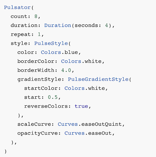
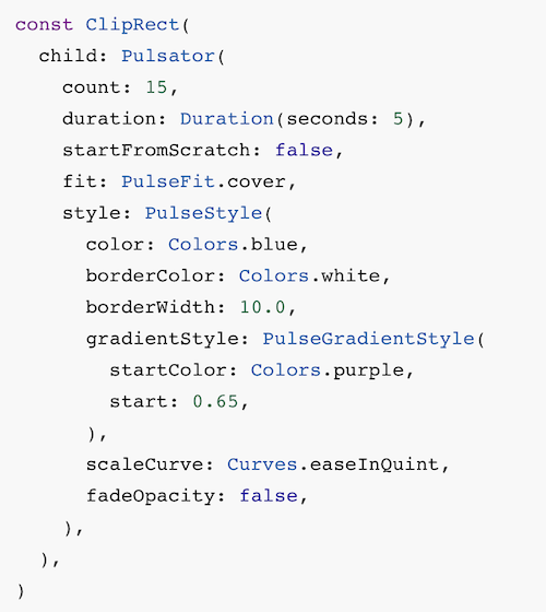
Pulsator Widget
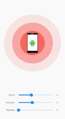
The Pulsator widget allows you to create pulsating animations with customizable styles. You can control the number of pulses, animation duration, repetition, and more. This widget is perfect for adding dynamic visual effects to specific areas of your app.
Pulsator(
  style: PulseStyle(color: Colors.blue),
  count: 5,
  duration: Duration(seconds: 4),
  repeat: 0,
  startFromScratch: false,
  autoStart: true,
  fit: PulseFit.contain,
  child: YourContentWidget(),
)
PulseIcon Widget
The PulseIcon widget simplifies the process of displaying an icon with a pulsing effect. It allows you to customize the pulse and icon properties effortlessly.
PulseIcon(
  icon: Icons.favorite,
  pulseColor: Colors.red,
  iconColor: Colors.white,
  iconSize: 44,
  innerSize: 54,
  pulseSize: 116,
  pulseCount: 4,
  pulseDuration: Duration(seconds: 4),
)
Features
- Customizable Styles: Tailor the pulse animation to your preferences with adjustable color, size, and gradient configurations.
- Dynamic Pulse Effects: Create dynamic and visually appealing pulsating animations that draw attention to specific elements in your UI.
- Icon Integration: Easily incorporate pulsating effects into your icons using the
PulseIconwidget for a more engaging user experience. - Flexible Configuration: Fine-tune the pulse behavior by adjusting parameters such as count, duration, repetition, and more.
Usage
Explore the various properties and customization options provided by the Pulsator and PulseIcon widgets to seamlessly integrate pulsating animations into your Flutter application. Experiment with different configurations to achieve the desired visual impact and enhance the overall user experience.
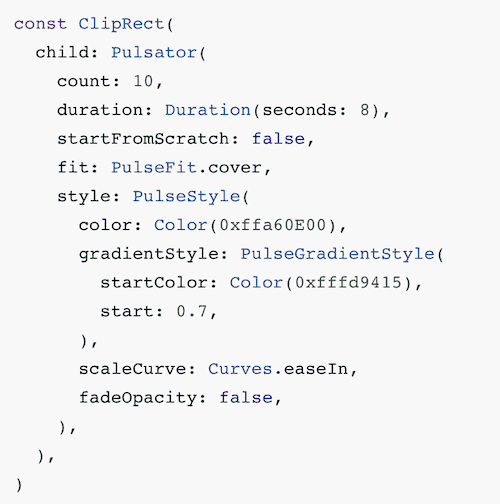
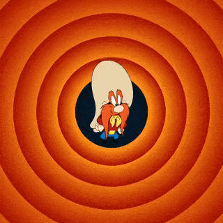
Juicy examples
CodePreview
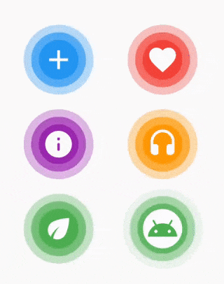

License
This project is licensed under the MIT License – see the LICENSE file for details.
Contributing
Please read CONTRIBUTING.md for details on my code of conduct, and the process for submitting pull requests to me.
The docs, please!
Pulsator Widget properties
PropertyTypeDescriptionstylePulseStylePulse style configuration. Required.countintNumber of pulses visible at a time. Default is 3.durationDurationDuration of a single pulse animation. Default is 2 seconds.repeatintNumber of times pulses will repeat. If 0, pulses will repeat forever. Default is 0.startFromScratchboolWhether the animation should start from the beginning. Default is true.autoStartboolWhether the animation should start automatically when the widget is created. Default is true.fitPulseFitHow the pulse should be scaled to fit the widget size. Default is PulseFit.contain.childWidget?The child of the widget that is rendered on top of the pulses. Default is null.
Events
EventDescriptiononCreatedInvoked when the animation controller is created.onCompletedInvoked when the animation is completed.
PulseIcon Widget properties
PropertyTypeDescriptioniconIconDataThe icon to display. Required.pulseColorColorThe color of the pulse. Required.iconColorColorThe color of the icon. Default is white.iconSizedoubleThe size of the icon. Default is 24.pulseSizedoubleThe size of the pulse. Default is 64.innerColorColor?The color of the inner, non-pulsing circle. Default is null.innerSizedouble?The size of the inner, non-pulsing circle. Default is null.pulseCountintThe number of pulses to display. Default is 3.pulseDurationDurationThe duration of a single pulse animation. Default is 4 seconds.
PulseStyle properties
PropertyTypeDescriptioncolorColorMain pulse color. Default is Colors.red.borderColorColor?Pulse border color. If null, no border will be rendered. Default is null.borderWidthdouble?Pulse border width. If null, no border will be rendered. Default is null.gradientStylePulseGradientStyle?If set, the pulse will be rendered as a gradient. Default is null.pulseCurveCurvePulse scale animation curve. Default is Curves.linear.opacityCurveCurvePulse opacity animation curve. Default is Curves.linear.fadeOpacityboolWhether the opacity should be animated from 1.0 to 0.0. Default is true.startSizedoubleThe size of the pulse when it begins, as a fraction of the pulse radius. Default is 0.0.
PulseGradientStyle properties
PropertyTypeDescriptionradiusdoubleThe radius of the gradient, as a fraction pulse radius. Default is 0.5.startdoubleThe start point of the gradient, as a fraction of the pulse radius. Default is 0.0.enddoubleThe end point of the gradient, as a fraction of the pulse radius. Default is 1.0.startColorColor?The start color of the gradient. If null, the pulse color will be used with the opacity set to 0.0. Default is null.reverseColorsboolWhether the gradient colors should be reversed. If true, the gradient will start from end and end at start. Default is false.
PulseFit enum
ValueDescriptioncontainThe pulse will be scaled to fit the widget size.coverThe pulse will be scaled to fill the widget size.