Introduction
In the ever-evolving world of mobile app development, creating user-friendly and visually appealing interfaces is crucial for engaging users. Flutter, Google's UI toolkit, has emerged as a powerful solution for building cross-platform applications with ease. One of the standout widgets in Flutter is the "Expansion Tile Card," which offers a convenient way to present expandable content in a compact manner. In this blog post, we'll explore the Flutter Expansion Tile Card and walk through a practical example app to demonstrate its capabilities.
Understanding the Flutter Expansion Tile Card
In Flutter, an Expansion Tile Card is a flexible and interactive widget that allows you to display information in a collapsible manner. When users interact with the card, it smoothly expands to reveal additional content, providing a seamless user experience. This makes the Expansion Tile Card ideal for presenting lists of data or any content that benefits from a compact, space-saving layout.
Key Features and Benefits
- Intuitive Interaction: The Expansion Tile Card's simple tap-to-expand functionality ensures effortless user interaction, making it ideal for mobile applications.
- Optimized Space Usage: With limited screen real estate on mobile devices, the Expansion Tile Card helps conserve space by hiding detailed information until it's needed.
- Customizable Content: Flutter's Expansion Tile Card can accommodate various content types, such as text, images, icons, or even custom widgets, providing flexibility in design.
- Sleek Animations: The built-in expansion and contraction animations contribute to a polished user interface and enhance the overall user experience.
Example App:
To illustrate the power of the Expansion Tile Card in Flutter, let's create a simple app.
Step 1: Set up the Flutter Project
Before we begin, make sure you have Flutter installed and create a new Flutter project.
Step 2: Add Dependencies
In your project's pubspec.yaml file, add the following dependencies:
dependencies:
  flutter:
    sdk: flutter
  cupertino_icons: ^0.1.3
  expansion_tile_card: ^3.0.0
Step 3: Implement the Expansion Tile Card
In your main Dart file, implement the following code for the app:
import 'package:expansion_tile_card/expansion_tile_card.dart';
import 'package:flutter/material.dart';


void main() => runApp(const MyApp());


class MyApp extends StatelessWidget {
  const MyApp({super.key});
  @override
  Widget build(BuildContext context) {
    return MaterialApp(
      title: 'Flutter For Geeks',
      debugShowCheckedModeBanner: false,
      theme: ThemeData(
        primarySwatch: Colors.green,
      ),
      home: const MyHomePage(title: 'Flutter For Geeks'),
    );
  }
}


class MyHomePage extends StatefulWidget {
  const MyHomePage({Key? key, this.title}) : super(key: key);


  final String? title;


  @override
  _MyHomePageState createState() => _MyHomePageState();
}


class _MyHomePageState extends State<MyHomePage> {
  final GlobalKey<ExpansionTileCardState> cardA = GlobalKey();
  final GlobalKey<ExpansionTileCardState> cardB = GlobalKey();


  @override
  Widget build(BuildContext context) {
    final ButtonStyle flatButtonStyle = TextButton.styleFrom(
      shape: const RoundedRectangleBorder(
        borderRadius: BorderRadius.all(Radius.circular(4.0)),
      ),
    );


    return Scaffold(
      appBar: AppBar(
        title: Text(widget.title!),
      ),
      body: ListView(
        children: <Widget>[
          Padding(
            padding: const EdgeInsets.symmetric(horizontal: 12.0),
            child: ExpansionTileCard(
              key: cardA,
              leading: const CircleAvatar(child: Text('A')),
              title: const Text('Tap me!'),
              subtitle: const Text('I expand!'),
              children: <Widget>[
                const Divider(
                  thickness: 1.0,
                  height: 1.0,
                ),
                Align(
                  alignment: Alignment.centerLeft,
                  child: Padding(
                    padding: const EdgeInsets.symmetric(
                      horizontal: 16.0,
                      vertical: 8.0,
                    ),
                    child: Text(
                      """Hi there, I'm a drop-in replacement for Flutter's ExpansionTile.


Use me any time you think your app could benefit from being just a bit more Material.


These buttons control the next card down!""",
                      style: Theme.of(context)
                          .textTheme
                          .bodyMedium!
                          .copyWith(fontSize: 16),
                    ),
                  ),
                ),
                ButtonBar(
                  alignment: MainAxisAlignment.spaceAround,
                  buttonHeight: 52.0,
                  buttonMinWidth: 90.0,
                  children: <Widget>[
                    TextButton(
                      style: flatButtonStyle,
                      onPressed: () {
                        cardB.currentState?.expand();
                      },
                      child: const Column(
                        children: <Widget>[
                          Icon(Icons.arrow_downward),
                          Padding(
                            padding: EdgeInsets.symmetric(vertical: 2.0),
                          ),
                          Text('Open'),
                        ],
                      ),
                    ),
                    TextButton(
                      style: flatButtonStyle,
                      onPressed: () {
                        cardB.currentState?.collapse();
                      },
                      child: const Column(
                        children: <Widget>[
                          Icon(Icons.arrow_upward),
                          Padding(
                            padding: EdgeInsets.symmetric(vertical: 2.0),
                          ),
                          Text('Close'),
                        ],
                      ),
                    ),
                    TextButton(
                      style: flatButtonStyle,
                      onPressed: () {
                        cardB.currentState?.toggleExpansion();
                      },
                      child: const Column(
                        children: <Widget>[
                          Icon(Icons.swap_vert),
                          Padding(
                            padding: EdgeInsets.symmetric(vertical: 2.0),
                          ),
                          Text('Toggle'),
                        ],
                      ),
                    ),
                  ],
                ),
              ],
            ),
          ),
          Padding(
            padding: const EdgeInsets.symmetric(horizontal: 12.0),
            child: ExpansionTileCard(
              key: cardB,
              expandedTextColor: Colors.red,
              leading: const CircleAvatar(child: Text('B')),
              title: const Text('Tap me!'),
              subtitle: const Text('I expand, too!'),
              children: <Widget>[
                const Divider(
                  thickness: 1.0,
                  height: 1.0,
                ),
                Align(
                  alignment: Alignment.centerLeft,
                  child: Padding(
                    padding: const EdgeInsets.symmetric(
                      horizontal: 16.0,
                      vertical: 8.0,
                    ),
                    child: Text(
                      """Hi there, I'm a drop-in replacement for Flutter's ExpansionTile.


Use me any time you think your app could benefit from being just a bit more Material.


These buttons control the card above!""",
                      style: Theme.of(context)
                          .textTheme
                          .bodyMedium!
                          .copyWith(fontSize: 16),
                    ),
                  ),
                ),
                ButtonBar(
                  alignment: MainAxisAlignment.spaceAround,
                  buttonHeight: 52.0,
                  buttonMinWidth: 90.0,
                  children: <Widget>[
                    TextButton(
                      style: flatButtonStyle,
                      onPressed: () {
                        cardA.currentState?.expand();
                      },
                      child: const Column(
                        children: <Widget>[
                          Icon(Icons.arrow_downward),
                          Padding(
                            padding: EdgeInsets.symmetric(vertical: 2.0),
                          ),
                          Text('Open'),
                        ],
                      ),
                    ),
                    TextButton(
                      style: flatButtonStyle,
                      onPressed: () {
                        cardA.currentState?.collapse();
                      },
                      child: const Column(
                        children: <Widget>[
                          Icon(Icons.arrow_upward),
                          Padding(
                            padding: EdgeInsets.symmetric(vertical: 2.0),
                          ),
                          Text('Close'),
                        ],
                      ),
                    ),
                    TextButton(
                      style: flatButtonStyle,
                      onPressed: () {
                        cardA.currentState?.toggleExpansion();
                      },
                      child: const Column(
                        children: <Widget>[
                          Icon(Icons.swap_vert),
                          Padding(
                            padding: EdgeInsets.symmetric(vertical: 2.0),
                          ),
                          Text('Toggle'),
                        ],
                      ),
                    ),
                  ],
                ),
              ],
            ),
          ),
        ],
      ),
    );
  }
}
Step 4: Run the App
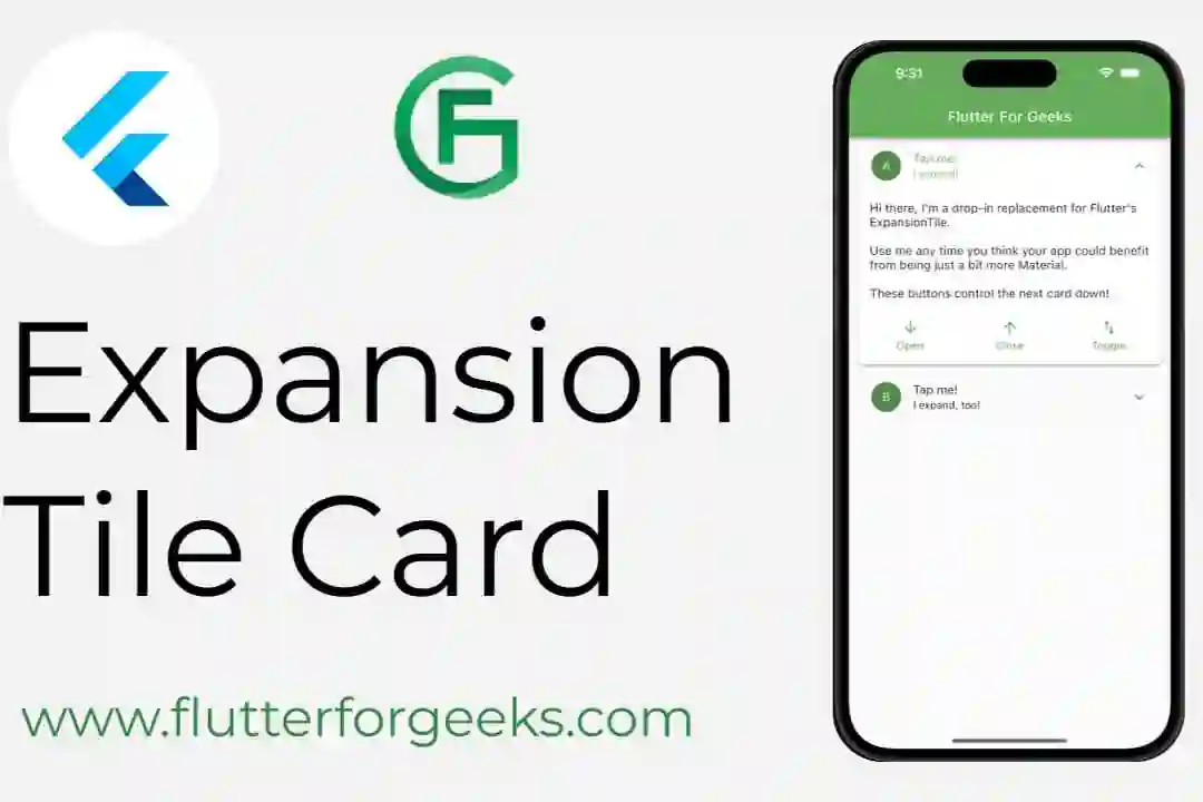
Save the changes and run your Flutter app using flutter run. You should now see the Task Management app with a list of tasks. Tapping on each task will expand the card to display its description.
Video Demo
Conclusion
The Flutter Expansion Tile Card is a versatile and interactive widget that significantly enhances user experience in mobile app development. Its ability to present content in a compact, collapsible format while maintaining an intuitive interface makes it a valuable addition to any Flutter application. In our Task Management app example, we demonstrated how easy it is to implement and customize the Expansion Tile Card to suit your specific needs.
As you explore Flutter's rich collection of widgets, consider incorporating the Expansion Tile Card to create dynamic and engaging user interfaces for your Flutter projects. Embrace the power of Flutter to build beautiful, cross-platform apps that captivate users and deliver an exceptional mobile experience. Happy coding!

