Introduction:
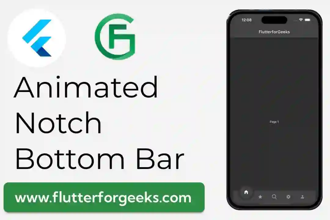
In this blog post, we'll explore the animated_notch_bottom_bar package, a powerful Flutter library that enables developers to create stunning and animated bottom navigation bars. We'll go through the process of installing the package, building a sample app, and exploring its various customization options. By the end of this tutorial, you'll have a solid understanding of how to implement the animated_notch_bottom_bar package in your Flutter projects.
Prerequisites:
To follow along with this tutorial, make sure you have Flutter and Dart installed on your development machine. Basic knowledge of Flutter widgets and navigation concepts is also helpful.
Step 1: Setting Up the Flutter Project
Let's start by creating a new Flutter project. Open your terminal and run the following commands:
flutter create animated_notch_bottom_bar_example
cd animated_notch_bottom_bar_example
Step 2: Installing the Package
Next, add the animated_notch_bottom_bar package to your pubspec.yaml file and run flutter pub get to install it:
dependencies:
  flutter:
    sdk: flutter
  animated_notch_bottom_bar: ^1.0.0 # Use the latest version available
  flutter_svg: ^2.0.7
Step 3: Importing the Package
In the main.dart file, import the necessary packages:
import 'package:flutter/material.dart';
import 'package:animated_notch_bottom_bar/animated_notch_bottom_bar.dart';
import 'package:flutter_svg/flutter_svg.dart'
Step 4: Creating a Sample App
Now, let's build a sample app to demonstrate the animated_notch_bottom_bar. We'll create a simple app with three pages that will be accessible through the bottom navigation bar.
GitHub Repository - Find the complete code for each example in this tutorial on GitHub.
import 'dart:developer';


import 'package:animated_notch_bottom_bar/animated_notch_bottom_bar/animated_notch_bottom_bar.dart';
import 'package:flutter/material.dart';
import 'package:flutter_svg/flutter_svg.dart';


void main() {
  runApp(const MyApp());
}


class MyApp extends StatelessWidget {
  const MyApp({Key? key}) : super(key: key);
  @override
  Widget build(BuildContext context) {
    return MaterialApp(
      debugShowCheckedModeBanner: false,
      title: 'Animated Notch Bottom Bar',
      theme: ThemeData.dark(),
      home: const MyHomePage(),
    );
  }
}


class MyHomePage extends StatefulWidget {
  const MyHomePage({Key? key}) : super(key: key);


  @override
  State<MyHomePage> createState() => _MyHomePageState();
}


class _MyHomePageState extends State<MyHomePage> {
  /// Controller to handle PageView and also handles initial page
  final _pageController = PageController(initialPage: 0);


  /// Controller to handle bottom nav bar and also handles initial page
  final _controller = NotchBottomBarController(index: 0);


  int maxCount = 5;


  @override
  void dispose() {
    _pageController.dispose();
    super.dispose();
  }


  /// widget list
  final List<Widget> bottomBarPages = [
    const Page1(),
    const Page2(),
    const Page3(),
    const Page4(),
    const Page5(),
  ];


  @override
  Widget build(BuildContext context) {
    return Scaffold(
      appBar: AppBar(title: const Text('FlutterforGeeks')),
      body: PageView(
        controller: _pageController,
        physics: const NeverScrollableScrollPhysics(),
        children: List.generate(
            bottomBarPages.length, (index) => bottomBarPages[index]),
      ),
      extendBody: true,
      bottomNavigationBar: (bottomBarPages.length <= maxCount)
          ? AnimatedNotchBottomBar(
              /// Provide NotchBottomBarController
              notchBottomBarController: _controller,
              color: const Color(0xFF424242),
              showLabel: false,
              notchColor: const Color(0xFF424242),


              /// restart app if you change removeMargins
              removeMargins: false,
              bottomBarWidth: 500,
              durationInMilliSeconds: 300,
              bottomBarItems: [
                const BottomBarItem(
                  inActiveItem: Icon(
                    Icons.home_filled,
                    color: Colors.grey,
                  ),
                  activeItem: Icon(
                    Icons.home_filled,
                    color: Colors.white,
                  ),
                  itemLabel: 'Page 1',
                ),
                const BottomBarItem(
                  inActiveItem: Icon(
                    Icons.star,
                    color: Colors.grey,
                  ),
                  activeItem: Icon(
                    Icons.star,
                    color: Colors.white,
                  ),
                  itemLabel: 'Page 2',
                ),


                ///svg example
                BottomBarItem(
                  inActiveItem: SvgPicture.asset(
                    'assets/search_icon.svg',
                    color: Colors.grey,
                  ),
                  activeItem: SvgPicture.asset(
                    'assets/search_icon.svg',
                    color: Colors.white,
                  ),
                  itemLabel: 'Page 3',
                ),
                const BottomBarItem(
                  inActiveItem: Icon(
                    Icons.settings,
                    color: Colors.grey,
                  ),
                  activeItem: Icon(
                    Icons.settings,
                    color: Colors.white,
                  ),
                  itemLabel: 'Page 4',
                ),
                const BottomBarItem(
                  inActiveItem: Icon(
                    Icons.person,
                    color: Colors.grey,
                  ),
                  activeItem: Icon(
                    Icons.person,
                    color: Colors.white,
                  ),
                  itemLabel: 'Page 5',
                ),
              ],
              onTap: (index) {
                /// perform action on tab change and to update pages you can update pages without pages
                log('current selected index $index');
                _pageController.jumpToPage(index);
              },
            )
          : null,
    );
  }
}


class Page1 extends StatelessWidget {
  const Page1({Key? key}) : super(key: key);


  @override
  Widget build(BuildContext context) {
    return Container(child: const Center(child: Text('Page 1')));
  }
}


class Page2 extends StatelessWidget {
  const Page2({Key? key}) : super(key: key);


  @override
  Widget build(BuildContext context) {
    return Container(child: const Center(child: Text('Page 2')));
  }
}


class Page3 extends StatelessWidget {
  const Page3({Key? key}) : super(key: key);


  @override
  Widget build(BuildContext context) {
    return Container(child: const Center(child: Text('Page 3')));
  }
}


class Page4 extends StatelessWidget {
  const Page4({Key? key}) : super(key: key);


  @override
  Widget build(BuildContext context) {
    return Container(child: const Center(child: Text('Page 4')));
  }
}


class Page5 extends StatelessWidget {
  const Page5({Key? key}) : super(key: key);


  @override
  Widget build(BuildContext context) {
    return Container(child: const Center(child: Text('Page 5')));
  }
}
Step 5: Customizing the AnimatedNotchBottomBar
The AnimatedNotchBottomBar widget provides various customization options to tailor the appearance and behavior of the bottom navigation bar. Here are some of the key properties you can customize:
backgroundColor: Set the background color of the bottom navigation bar.activeColor: Define the color of the active item in the navigation bar.inactiveColor: Specify the color of the inactive items in the navigation bar.iconSize: Set the size of the icons displayed in the navigation bar.notchMargin: Adjust the space between the notch and the navigation bar items.
You can experiment with these properties to achieve the desired look and feel for your app.
Video Demo
Conclusion:
In this tutorial, we've learned how to use the animated_notch_bottom_bar package to create an animated and visually appealing bottom navigation bar in Flutter. By following the step-by-step guide and creating a sample app, you now have the skills to integrate this package into your own projects and customize it to suit your specific requirements. Happy coding!
#Flutter #AnimatedNotchBottomBar #FlutterPackage #BottomNavigationBar #FlutterTutorial #FlutterUI #FlutterAnimation #MobileAppDevelopment #AppDevelopment #FlutterWidgets #FlutterTips #Programming #Coding #TechBlog #SoftwareDevelopment #MobileDevelopment #UIAnimation #FlutterExamples #FlutterCommunity #MobileUI #Dart #FlutterDart #UIEffects #FlutterDev #FlutterApps #FlutterDesign #FlutterProjects #FlutterCoding #FlutterLearning #FlutterExplained #MobileAppDesign #FlutterDevelopmentGuide

