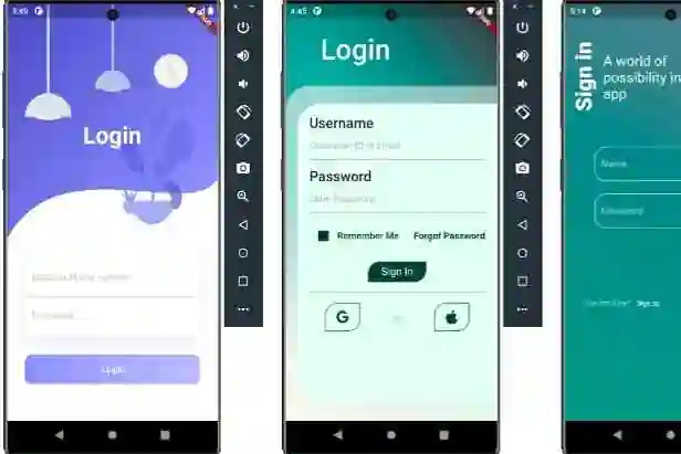
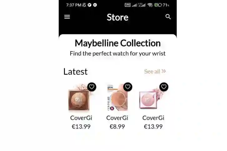
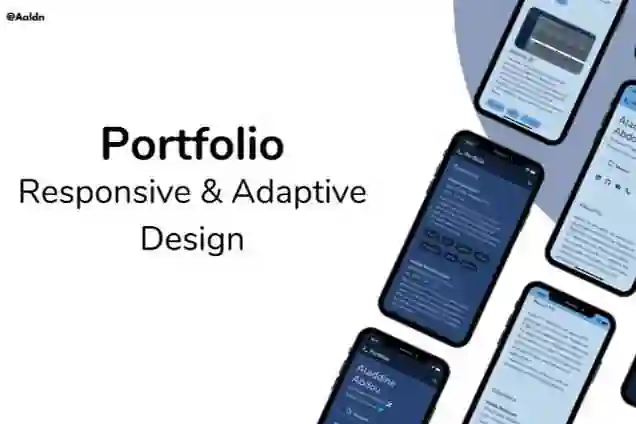
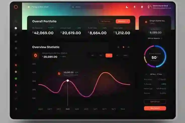
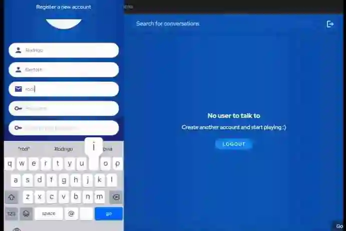
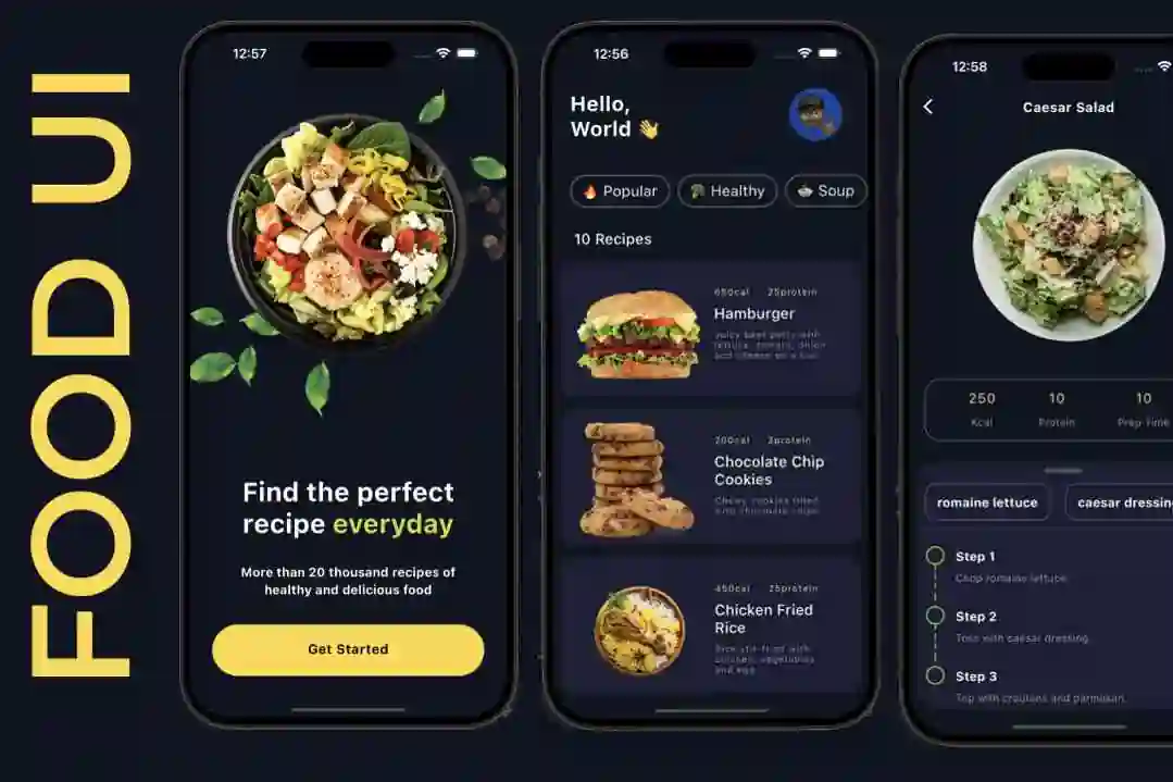
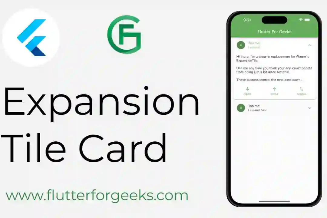
A curated library of pre-styled, reusable Flutter widgets organized based on Atomic Design principles to build apps at scale.
Learn more at atomsbox.com!
Getting started
To use any pre-styled component from atomsbox, follow these steps:
- Add the latest version of the package in your
pubspec.yaml:
dependencies:
  atomsbox: <latest_version>
- To keep atomsbox design, import the package and use the pre-defined theme from the library
import 'package:atomsbox/atomsbox.dart';
import 'package:flutter/material.dart';

void main() {
  runApp(const MyApp());
}

class MyApp extends StatelessWidget {
  const MyApp({Key? key}) : super(key: key);

  @override
  Widget build(BuildContext context) {
    return MaterialApp(
      theme: AppTheme.theme,
      darkTheme: AppTheme.darkTheme,
      themeMode: currentMode,
      home: const HomeScreen(),
    );
  }
}
Usage
Three examples of how to use atomsbox components in your Flutter apps. More components are available, check the component gallery at atomsbox.com!
Create an AppCardImageAndContentBlock pre-styled component
AppCardImageAndContentBlock(
  margin: const EdgeInsets.only(bottom: AppConstants.sm),
  headline: AppText('This is a card'),
  subhead: sampleText,
  actions: [
    AppFilledButton(
        onPressed: () {}, child: AppText('Action 1')),
    AppFilledButton.gradient(
        onPressed: () {}, child: AppText('Action 2')),
  ],
),
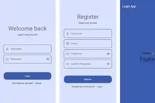
Create an AppForm pre-styled component
AppForm(
  title: AppText('This is a form'),
  description: AppText('This is a form description'),
  formButton: AppFilledButton(
    onPressed: () {},
    child: AppText('Submit'),
  ),
  formItemNames: const ['One', 'Two', 'Three'],
  formItems: [
    AppTextFormField(),
    AppTextFormField(),
    AppTextFormField(),
  ],
),
Create an AppTab pre-styled component
AppTab(
  tabs: [
    Tab(
      icon: Column(
        mainAxisAlignment: MainAxisAlignment.spaceAround,
        children: [Icon(Icons.code), AppText('Atoms')],
      ),
    ),
    Tab(
      icon: Column(
        mainAxisAlignment: MainAxisAlignment.spaceAround,
        children: [Icon(Icons.code), AppText('Molecules')],
      ),
    ),
  ],
  children: [
    Column(
      children: [
        AppCard.elevated(
          height: 300,
          width: double.infinity,
          child: Center(child: AppText('Atoms')),
        ),
      ],
    ),
    Column(
      children: [
        AppCard.elevated(
          height: 300,
          width: double.infinity,
          child: Center(child: AppText('Molecules')),
        ),
      ],
    ),
  ],
),
Apps built with atomsbox
- Music App – an example of how to build a music app UI with atomsbox components.
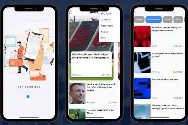
- News App – an example of how to build a news app UI with atomsbox components.
Components & Examples
Contributions are welcome! However, you can also request new components by opening a new issue and describing the desired component: Request a feature
Here is an extensive list of the currently available pre-styled components with their respective examples!
CategoryComponentatomsApp TextatomsApp ImageatomsApp Icon ButtonatomsApp Text ButtonatomsApp Elevated ButtonatomsApp Filled ButtonatomsApp Outlined ButtonatomsApp CardatomsApp GlassatomsApp Gradient BackgroundatomsApp SlideratomsApp Text Form FieldatomsApp Gradient TextatomsApp LabelmoleculesApp Expansion TilemoleculesApp Segmented ButtonmoleculesApp List TilemoleculesApp Card With Image And Content BlockmoleculesApp Card Image OverlaymoleculesApp Text BlockmoleculesApp User CardmoleculesApp Search With AutocompleteorganismsApp FormorganismsApp GridorganismsApp ListorganismsApp DrawerorganismsApp Bottom Nav BarorganismsApp Data TableorganismsApp CarouselorganismsApp TaborganismsApp Audio Card
Contributions
Contributions are welcome! If you find a bug, have a feature request, or would like to improve the package, go ahead and create a new issue:
- Report a bug
- Improve documentation
- Request a feature
- Optimize the performance of existing components
- Enhance the test suite of the package
Feel free to get in touch to discuss more, email at: massimo@atomsbox.com

