 Super Cupertino Navigation Bar
Flutter Extension
Super Cupertino Navigation Bar
Customize your iOS-style navigation bar and elevate the user experience of your project.
As a developer who appreciates Cupertino’s elegant design, wouldn’t you want to add this custom package to your app in development? The Super Cupertino Navigation Bar helps you create an iOS-style navigation bar while allowing you to add a search field and customize avatars.
Floated Large TitlePinned Large TitleOnly Large Title
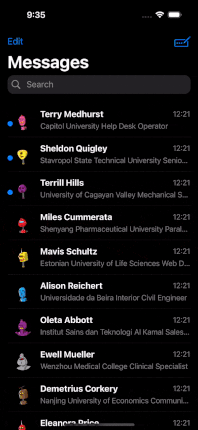
 Normal Navbar FloatedNormal Navbar Pinned
It’s been necessary from the beginning, and I just did it.

Why Should You Use Super Cupertino Navigation Bar?
- iOS-Style Navigation Bar: Offer a more familiar experience to your iOS users. The Super Cupertino Navigation Bar reflects the native look and feel of iOS devices.
- Search Field: Help users find content in your app more quickly and easily. Provide users with the ability to search.
- Avatar Customization: Empower users to personalize their profiles. Customizable avatar addition is a fantastic way to recognize and customize users.
- Perfect Compatibility: Seamlessly integrates with the Cupertino library. It works harmoniously with other components of your Flutter app.
- Transition Animations: With this extension, you can have all transition animation on page route.
Okay! Let’s dive deep!
Examples. Enjoy!
Table of Content
- Getting Started
- SuperCupertinoNavigationBar Attributes
- AppBarType Enum
- SearchFieldDecoration Attributes
- SearchFieldBehaviour Enum
- SearchResultHeader Attributes
- AvatarModel Attributes
Getting Started
Add dependency
dependencies:
  super_cupertino_navigation_bar: ^1.0.0
Add import package
import 'package:super_cupertino_navigation_bar/super_cupertino_navigation_bar.dart';
Easy to use
SuperCupertinoNavigationBar widget has CustomScrollView widget in it so you should place your children in slivers key whose type List.
CupertinoPageScaffold(  //inside CupertinoPageScaffold
  child: SuperCupertinoNavigationBar(
      largeTitleType: AppBarType.LargeTitleWithFloatedSearch, // Set desired AppBarType
      avatarModel: AvatarModel(
        avatarUrl: null,
        avatarIsVisible: true, // Avatar is hidden as default, if you want to set visible, simply set true
        onTap: () => print("some event"),
      ),
      largeTitle: const Text('Home'),
      searchFieldDecoration: SearchFieldDecoration(
          hideSearchBarOnInit: true,
          searchFieldBehaviour: SearchFieldBehaviour.ShowResultScreenAfterFieldInput, // There are 3 SearchFieldBehaviour
      ),
      slivers: [
        // Any Sliver here
      ],
  ),
);
SuperCupertinoNavigationBar Attributes
AttributeTypeAnnotationlargeTitleWidgetSupply Text widget in order to get right transition animationleadingWidgetYou can add desired Widget left top of NavbarautomaticallyImplyLeadingboolused for removing the back button, from the second screen after navigating to routeautomaticallyImplyTitleboolIf true and [largeTitle] is null, automatically fill in a Text() widget with the current route’s titlealwaysShowMiddleboolThis should be set to false if you only want to show [largeTitle] in expanded state and [middle] in collapsed statephysicsScrollPhysicsSuperCupertinoNavigationBar has CustomScrollView in it. Physic is used to set CustomScrollView’s physicspreviousPageTitleStringManually specify the previous route’s title when automatically implying the leading back buttonmiddleWidgetWidget to place in the middle of the navigation bar. Normally a title or a segmented control.trailingWidgetWidget to place at the end of the navigation bar. Normally additional actions taken on the page such as a search or edit function.borderBorderThe direction in which the widget content will line upbackgroundColorColorThe background color of the navigation bar. If it contains transparency, the tab bar will automatically produce a blurring effect to the content behind it. Defaults to CupertinoTheme’s scaffoldBackgroundColor if null.collapsedBackgroundColorColorThe background color of the collapsed navigation bar. If it contains transparency, the tab bar will automatically produce a blurring effect to the content behind it. Defaults to CupertinoTheme’s barBackgroundColor if null.brightnessBrightnessThe brightness of the specified backgroundColor. Setting this value changes the style of the system status bar.paddingEdgeInsetsDirectionalPadding for the contents of the navigation bar. Defaults: Vertically, sized to the same height as the navigation bar itself minus the status bar. Horizontally, padding will be 16 pixelstransitionBetweenRoutesboolSet true for transition between navigation barsheroTagObjectTag for the navigation bar’s Hero widget if transitionBetweenRoutes is truestretchboolThis specifies navbar behavior when negative scroll has been done. It moves with scroll contents when it’s true. But it will be static on scrolling.sliversList[Widget]SuperCupertinoNavigationBar has CustomScrollView so place all of your children place here as Sliver Widget such as SliverToBoxAdapter etc.scrollControllerScrollControllerSuperCupertinoNavigationBar has own scrollController but if you want to add scrollController as custom, you can set here. this will be used as primary scrollControllerappBarTypeAppBarType (Enum)AppBarType is an enum and it sets Appbar as Large Title or Normal Navbar and whether it has Search Bar or not.Values: LargeTitleWithPinnedSearch, LargeTitleWithFloatedSearch, LargeTitleWithoutSearch, NormalNavbarWithPinnedSearch, NormalNavbarWithFloatedSearch
searchFieldDecorationSearchFieldDecoration (Model)This is Search Field Model which you can find extended information belowavatarModelAvatarModel (Model)This is Avatar Model which you can find extended information below
AppBarType Enum
AppBarType values below;
enum AppBarType {
  LargeTitleWithPinnedSearch,
  LargeTitleWithFloatedSearch,
  LargeTitleWithoutSearch,
  NormalNavbarWithPinnedSearch,
  NormalNavbarWithFloatedSearch,
}
SearchFieldDecoration Attributes
AttributeTypeAnnotationcontrollerTextEditingControllerSearchField TextEditingControlleronChangedValueChanged[String]get Text value onChange and do some EventonSubmittedValueChanged[String]get Text value onSubmit and do some EventplaceholderTextStringSearchField Placeholder Text ValuedecorationBoxDecorationStyle your search fieldkeyboardTypeTextInputTypeSelect TextInputTypepaddingEdgeInsetsGeometryonly horizontal padding is applicableprefixIconColorColorplaceholderColorColorprefixInsetsEdgeInsetsGeometrypadding around prefix iconprefixIconWidgetSelect desired Icon, default is Icon(CupertinoIcons.search)suffixInsetsEdgeInsetsGeometrypadding around suffix iconsuffixIconIconSelect desired Icon, default is Icon(CupertinoIcons.xmark_circle_fill)onSuffixTapVoidCallbackNo return value supplied. Just Clears th search field and you can do some eventonCancelTapVoidCallbackNo return value supplied. Just Clears th search field and cancels search actions. Also you can do some eventpaddingLeftdoublepaddingRightdoublecancelButtonNameStringcancelButtonStyleTextStylecursorColorColoronFocusedValueChanged[bool]triggers desired event on search field focushideSearchBarOnInitboolthis is applicable only LargeTitleWithFloatedSearch and NormalNavbarWithFloatedSearchsearchFieldBehaviourSearchFieldBehaviour (Enum)This specifies result screen behavior. 3 behaviour may be set:ShowResultScreenAfterFieldInput, ShowResultScreenAfterFieldFocused, NeverShowResultScreen.
searchResultHeaderSearchResultHeader (Widget)This is just model which is required to set height and child attributessearchResultChildrenList[Widget]This appears according to SearchFieldBehaviour. You can set children here after desired action such as onChanged, onSubmitted etc.
SearchFieldBehaviour Enum
SearchFieldBehaviour values below;
enum SearchFieldBehaviour {
  ShowResultScreenAfterFieldInput,
  ShowResultScreenAfterFieldFocused,
  NeverShowResultScreen,
}
Let’s look at expected behaviour;
ShowResultScreenAfterFieldInputShowResultScreenAfterFieldFocusedNeverShowResultScreen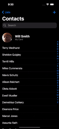
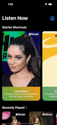
SearchResultHeader
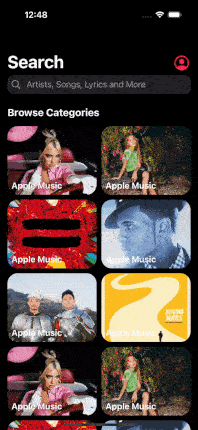
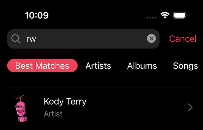
After search field action, result screen will appear and in this screen below the search bar you can place any widget you want! Let’s look at picture
Example 1 Apple MusicExample 2 Apple Music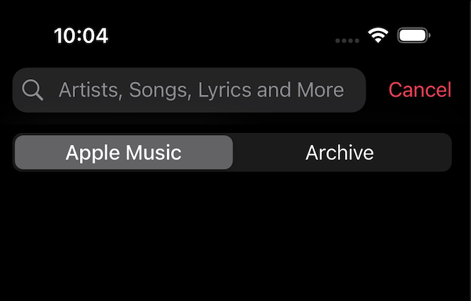
const SearchResultHeader({
  super.key,
  required this.height,
  required this.child,
});
AvatarModel Attributes
You can set avatar like Apple Applications do. See the required model attributes;
AttributeTypeAnnotationavatarUrlStringwrite here url string of Image.asset(url)avatarIsVisiblebooldefault value is falseonTapVoidCallbackCallback, set event onTapavatarIconColorColoravatar icon default color is CupertinoColors.linkiconIconDatayou can change default icon which is CupertinoIcons.profile_circled
AvatarModel({
  this.avatarUrl,
  this.avatarIsVisible = false,
  this.onTap,
  this.avatarIconColor = CupertinoColors.link,
  this.icon = CupertinoIcons.profile_circled,
});
Some Notices
- If you want to use default navigation bar, you can use simply this way;
CupertinoPageScaffold(
  navigationBar: DefaultCupertinoNavigationBar( // same as CupertinoNavigationBar but little differencies
  backgroundColor: CupertinoColors.systemGrey.withOpacity(0.5),
  middle: const Text('CupertinoNavigationBar Sample'),
  )
);
- Without using default navigation bar, You can use SuperCupertinoNavigationBar without largeTitle. Simply use this value;
CupertinoPageScaffold(  //inside CupertinoPageScaffold
  child: SuperCupertinoNavigationBar(
    largeTitleType: AppBarType.NormalNavbarWithoutSearch, // This will make appbar like CupertinoNavigationBar
    middle: Text("Home")
    slivers: [
      // Any Sliver here
    ],
  ),
);
in these case, you should be aware of you will use custom scroll view and sliver widgets.
Contribute and Provide Feedback
If you wish to contribute to this project, take a look at my GitHub repository and report any issues or bugs. You can help me further improve the project!
License
This package is licensed under the MIT License. For detailed information, check the LICENSE file.