Flutter Persian Calendar: A Widget for Jalali (Persian) Date Display

This Flutter package provides a simple and customizable Persian calendar widget for easy integration into your Flutter project. The package is based on shamsi_date.
Features
- Filter Start and End Date: You can add start-date and end-date to filter showing dates.
- Customization Options: Tailor the appearance of the calendar to fit your application’s theme with customizable options.
Usage
Add it to your pubspec.yaml file:
dependencies:

flutter_persian_calendar: ^0.0.2
Then, run the following command in your terminal:
flutter pub get
In your library add the following import:
import 'package:flutter_persian_calendar/flutter_persian_calendar.dart';
check example to use:
//import package at top of class
import  'package:flutter_persian_calendar/flutter_persian_calendar.dart';

 //Create a button to user tap on it and show calendar to select date
ElevatedButton(
   onPressed: () {
    //Show calendar in Dialog
     showDialog(
       context: context,
       builder: (context) {
         return Dialog(
           child:
               shamsiDateCalendarWidget(context, calendarDarkTheme),
         );
       },
     );
   },
   child: const Text('Select Date'),
 );

//Can create a base Calendar widget to show with different Themes
  PersianCalendar shamsiDateCalendarWidget(
    BuildContext context,
    //Pass different Theme
    PersianCalendarTheme calendarTheme,
  ) {
    return PersianCalendar(
      calendarHeight: 376, //set height of calendar widget to 376
      calendarWidth: 360, //set width of calendar widget to 360
      selectedDate: selectedDate, // the selected date shown in initializing calendar widget
      onDateChanged: (newDate) {
        // type of newDate and selectedDate should be Jalali
          selectedDate = newDate; // set the selectedDate to new selected date
      },
      onConfirmButtonPressed: () {
        Navigator.pop(context); // pop widget when user press on confirm button
      },
      calendarStartDate: Jalali(1300, 4, 12), // show calendar from 1300/4/12
      calendarEndDate: Jalali(1402, 7, 10), // show calendar until 1402/7/10
      calendarTheme: calendarTheme, // set calendarTheme that is passed here
    );
  }
Customization
You can change colors, textStyle, and the height and width of items in PersianCalendarTheme. Here is a customized lightTheme:
 // Model of calendar Theme
PersianCalendarTheme(
  backgroundColor: const Color(0XFFEDF2F4),
  selectedColor: const Color(0XFFEF233C),
  headerBackgroundColor: const Color(0XFF8D99AE),
  textStyle: const TextStyle(
    fontSize: 14,
    color: Colors.black,
  ),
  selectedItemTextStyle: const TextStyle(
    fontSize: 14,
    color: Color(0XFFF2F2F2),
  ),
  confirmButtonTextStyle: const TextStyle(
    fontSize: 14,
    color: Color(0XFFF2F2F2),
  ),
  headerTextStyle: const TextStyle(
    fontSize: 14,
    color: Colors.black,
  ),
);
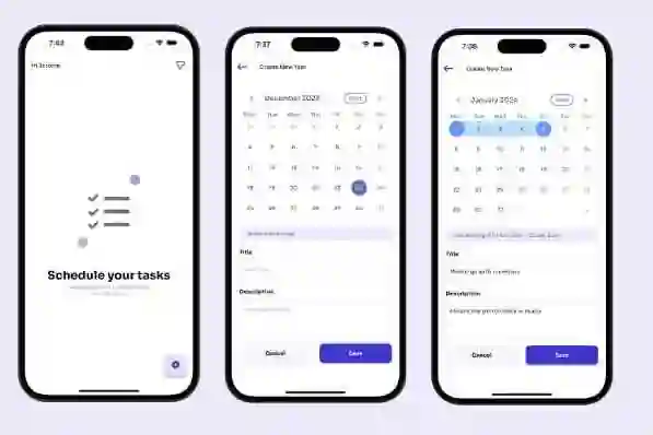
Output screenshot:

Contributions
We welcome contributions from the community! If you’d like to contribute to the development of Flutter Persian Calendar, please follow these guidelines:
Reporting Issues
If you encounter any issues with the package or have suggestions for improvements, please open an issue on the GitHub issue tracker. When reporting issues, please provide detailed information about the problem, including steps to reproduce it and your environment (Flutter version, platform, etc.).
Making Changes
- Fork the repository.
- Create a new branch for your feature or bug fix:
git checkout -b feature/my-featureorgit checkout -b bugfix/fix-issue. - Make your changes and test thoroughly.
- Commit your changes:
git commit -m 'Add some feature'. - Push to the branch:
git push origin feature/my-feature. - Submit a pull request.
Feel free to use or modify this version based on your preferences!

