Introduction:
In the world of Flutter development, creating visually appealing and dynamic layouts is key to crafting engaging user interfaces. One powerful layout widget that helps achieve this is the Staggered GridView. In this blog post, we will explore the ins and outs of implementing a Staggered GridView in Flutter, unlocking new possibilities for creating stunning and responsive designs.
What is a Staggered GridView?
A Staggered GridView is a versatile layout widget in Flutter that allows for the arrangement of items in a grid-like structure, with varying sizes and positions. Unlike a traditional GridView, where items are aligned in a regular pattern, a Staggered GridView offers flexibility by enabling items to have different heights and widths, creating an appealing mosaic-like layout.
There is a popular and helpful flutter package which provides a collection of Flutter grids layouts.
Layouts from the package
1.Staggered
2.Masonry
3.Quilted
4.Woven
5.Staired
6.Aligned
I will add a little more about the first two layouts.
Staggered
Properties
- Grid —Evenly divided in n columns, Small number of items, Not scrollable
- Tile — Must occupy 1 to n columns
- Placement algorithm — Top-most and then left-most
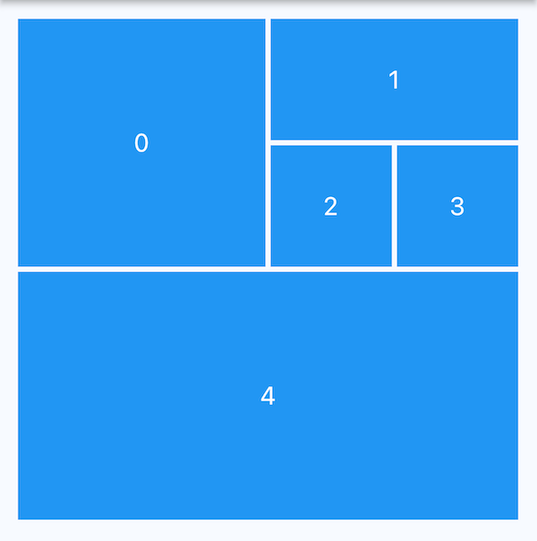
StaggeredGrid
StaggeredGrid.count(
  crossAxisCount: 4,
  mainAxisSpacing: 4,
  crossAxisSpacing: 4,
  children: const [
    StaggeredGridTile.count(
      crossAxisCellCount: 2,
      mainAxisCellCount: 2,
      child: Tile(index: 0),// your custom Tile widget here
    ),
    StaggeredGridTile.count(
      crossAxisCellCount: 2,
      mainAxisCellCount: 1,
      child: Tile(index: 1),
    ),
    StaggeredGridTile.count(
      crossAxisCellCount: 1,
      mainAxisCellCount: 1,
      child: Tile(index: 2),
    ),
    StaggeredGridTile.count(
      crossAxisCellCount: 1,
      mainAxisCellCount: 1,
      child: Tile(index: 3),
    ),
    StaggeredGridTile.count(
      crossAxisCellCount: 4,
      mainAxisCellCount: 2,
      child: Tile(index: 4),
    ),
  ],
);
Masonry
Here Container heights are sized based on the widget size. This is different from SliverGridDelegate for performance reasons.
Properties
- Grid — Evenly divided in n columns
- Tile — Must occupy 1 column only
- Placement algorithm — Top-most and then left-most
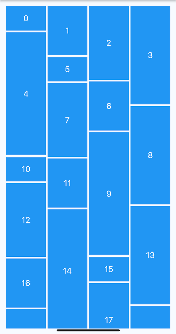
MasonryGridView
Usage
MasonryGridView.count(
  crossAxisCount: 4,
  mainAxisSpacing: 4,
  crossAxisSpacing: 4,
  itemCount: 20,
  itemBuilder: (context, index) {
// your custom Tile widget here
    return Tile(
      index: index,
      height: (index % 5 + 1) * 60,
    );
  },
);
Here I have created a small demo using Masonry layout.
Getting Started:
To begin working with the Staggered GridView widget, follow these steps:
Step 1: Add the Flutter package:
In your Flutter project's pubspec.yaml file, include the flutter_staggered_grid_view package as a dependency:
dependencies:
  flutter_staggered_grid_view: <latest_version>
Step 2: Import the necessary classes:
In your Dart file, import the required classes from the package:
import 'package:flutter_staggered_grid_view/flutter_staggered_grid_view.dart';
Implementing a Staggered GridView:
Let's dive into the process of implementing a Staggered GridView in Flutter.
Step 1: Set up the Staggered GridView:
Wrap your Staggered GridView within a parent container or a Scaffold. Define the crossAxisCount parameter to specify the number of columns in the grid:
MasonryGridView.count(
          crossAxisCount: 2,
          crossAxisSpacing: 10,
          mainAxisSpacing: 12,
          itemCount: imageList.length,
          itemBuilder: (context, index) {
            return Container(
              decoration: const BoxDecoration(
                  color: Colors.transparent,
                  borderRadius: BorderRadius.all(Radius.circular(15))),
              child: ClipRRect(
                borderRadius: const BorderRadius.all(Radius.circular(15)),
                child: FadeInImage.memoryNetwork(
                  placeholder: kTransparentImage,
                  image: imageList[index],
                  fit: BoxFit.cover,
                ),
              ),
            );
          },
        ),
This is how it looks in the end.

You can find the full code from here.
For more details of other layouts you can check the package readme.
Video Demo
Conclusion:
The Staggered GridView widget in Flutter opens up a world of creative possibilities for designing dynamic and visually appealing layouts. Its ability to arrange items with varying sizes and positions brings an element of uniqueness to your UI. By following the steps outlined in this blog post, you can easily implement a Staggered GridView in your Flutter projects and unlock the potential for stunning and responsive designs.
Whether you're building a photo gallery, a card-based UI, or a product catalog, the Staggered GridView empowers you to create captivating user experiences. Experiment with different configurations, leverage the flexibility it offers, and take your Flutter layouts to new heights.
Happy coding!