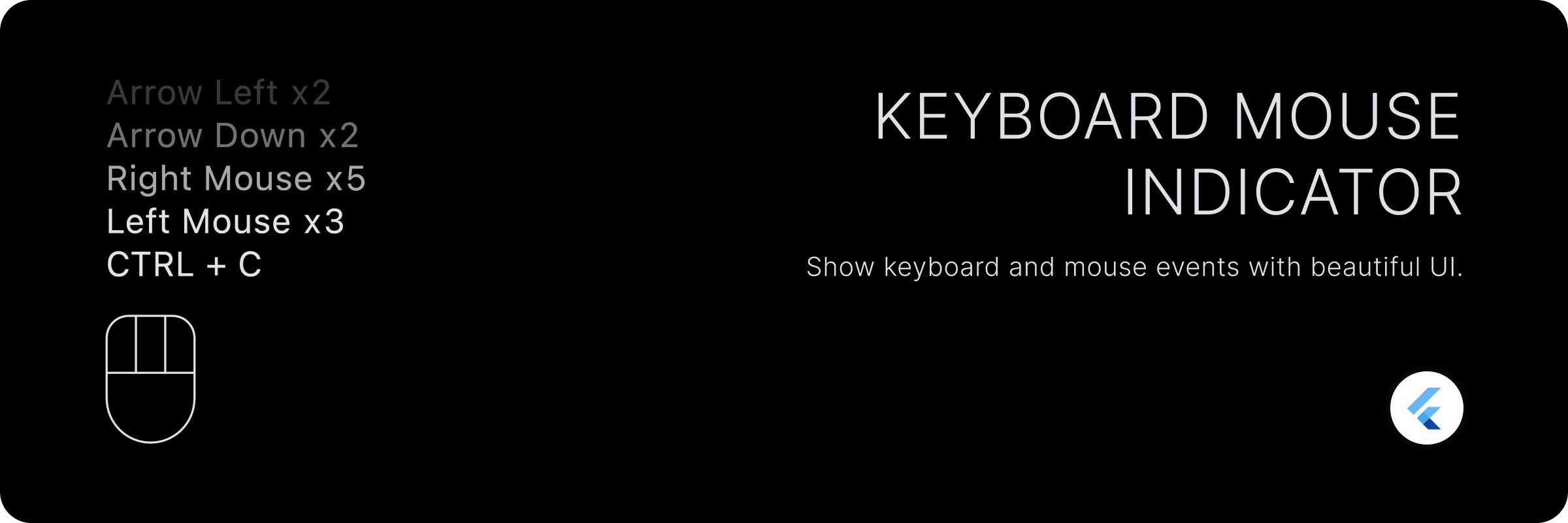
Keyboard Mouse Indicator
A beautiful widget that shows mouse and keyboard events.
Features
- Global listeners for mouse and keyboard events that do not rely on focus.
- Show events as a history of key combinations.
- Customizable count for history items visible.
- Show current keys pressed. (minimal keyboard indicator)
- Fully customizable mouse indicator.
- Customizable keyboard history items.
- Displays counts for each individual and composed events.
Getting started
Add the package to your pubspec.yaml file:
dependencies:
  keyboard_mouse_indicator: <latest_version>
Usage
Use the KeyboardMouseIndicator widget to show the indicator.
KeyboardMouseIndicator(
  controller: controller,
  alignment: Alignment.bottomLeft,
  showAsHistory: true,
);
PropertyDescriptioncontrollerThe controller to control the indicator.alignmentThe alignment of the indicator. This affect the alignment of the history item text too.showAsHistoryWhether to show events as a history or current keys pressed. Currently pressed keys are displayed if this is set to false.mouseIndicatorThe widget to show for mouse indicator.maxLengthThe maximum length of history to show.fadeTextWhether to fade the text of history items to have disappearing effect.itemSpacingThe spacing between history items.showMouseIndicatorWhether to show mouse indicator.keyLabelBuilderThe builder to build the key label string.itemBuilderThe builder to build the history item widget.
This will show keyboard and mouse events as a history with maximum of 5 events.
Customization
Showing more history.
By default, the widget shows only 5 events as a history. You can change this by setting maxLength property.
KeyboardMouseIndicator(
  alignment: Alignment.bottomLeft,
  showAsHistory: true,
  maxLength: 10, // Show recent 10 events
);
Showing current keys pressed.
By default, the widget shows events as a history. You can change this by setting showAsHistory property to false. It will show current keys pressed.
KeyboardMouseIndicator(
  alignment: Alignment.bottomLeft,
  showAsHistory: false,
);
Manually clearing history/keys pressed.
You can clear the history/keys pressed by calling clear method on KeyboardMouseController.
- Pass
KeyboardMouseControllertoKeyboardMouseIndicatorwidget.
final controller = KeyboardMouseController();

KeyboardMouseIndicator(
  controller: controller,
  alignment: Alignment.bottomLeft,
  showAsHistory: true,
);
- Call
clearmethod onKeyboardMouseControllerto clear history/keys pressed.
controller.clear();
Customizing mouse indicator widget.
You can customize the mouse indicator widget by passing mouseIndicator property to KeyboardMouseIndicator widget.
KeyboardMouseIndicator(
  controller: controller,
  alignment: Alignment.bottomLeft,
  showAsHistory: true,
  mouseIndicator: MouseIndicator(
    height: 72,
  ),
);
Styling mouse indicator widget
You can style the mouse indicator widget by passing style property to MouseIndicator widget. MouseIndicatorStyle has two types: MouseIndicatorStyle.filled and MouseIndicatorStyle.outlined. By default, it is MouseIndicatorStyle.outlined.
KeyboardMouseIndicator(
  controller: controller,
  alignment: Alignment.bottomLeft,
  showAsHistory: true,
  mouseIndicator: MouseIndicator(
    height: 72,
    style: MouseIndicatorStyle.outlined(
      borderColor: Colors.white,
      indicatorColor: Colors.white,
      backgroundColor: Colors.transparent,
      borderWidth: 4,
      showScrollButton: true,
      scrollButtonWidth: 48,
      buttonsHeightFactor: 0.5,
      borderRadius: BorderRadius.circular(8),
    ),
  ),
);
PropertyDescriptionborderColorThe color of border of the mouse indicator. Defaults to ColorScheme.onSurface.indicatorColorThe color of indicator of the mouse indicator. Defaults to borderColor.backgroundColorThe color of background of the mouse indicator.borderWidthThe width of border of the mouse indicator.showScrollButtonA boolean value that indicates whether to show scroll button or not.scrollButtonWidthThe width of scroll button. It is used to adjust the width of scroll button. scrollButtonWidthFactor can be used in place of this to provide width in terms of percentage.buttonsHeightFactorThe height percentage of mouse buttons. It is used to adjust the height of mouse buttons.scrollButtonWidthFactorThe width percentage of scroll button. Scroll button width can be provided in terms of percentage of available width for a single button as if all 3 buttons are of same width. This can be used in place of scrollButtonWidth.borderAllows to provide custom border for the mouse indicator. Any OutlinedBorder can be used here. If this is provided, borderColor, borderWidth and borderRadius must not be provided.
For more details, please refer to the documentation of MouseIndicatorStyle.
Similarly, you can use MouseIndicatorStyle.filled to style the mouse indicator widget.
KeyboardMouseIndicator(
  controller: controller,
  alignment: Alignment.bottomLeft,
  showAsHistory: true,
  mouseIndicator: MouseIndicator(
    height: 72,
    style: MouseIndicatorStyle.filled(
      indicatorColor: Colors.white,
      backgroundColor: Colors.transparent,
      showScrollButton: true,
      scrollButtonWidth: 48,
      buttonsHeightFactor: 0.5,
      spacing: 12,
    ),
  ),
);
PropertyDescriptionindicatorColorThe color of indicator of the mouse indicator. Defaults to ColorScheme.onSurface.backgroundColorThe color of background of the mouse indicator.showScrollButtonA boolean value that indicates whether to show scroll button or not.scrollButtonWidthThe width of scroll button. It is used to adjust the width of scroll button. scrollButtonWidthFactor can be used in place of this to provide width in terms of percentage.buttonsHeightFactorThe height percentage of mouse buttons. It is used to adjust the height of mouse buttons.scrollButtonWidthFactorThe width percentage of scroll button. Scroll button width can be provided in terms of percentage of available width for a single button as if all 3 buttons are of same width. This can be used in place of scrollButtonWidth.spacingThe spacing between mouse buttons.
Custom items UI for history.
You can customize the UI of history items by passing itemBuilder property to KeyboardMouseIndicator widget.
KeyboardMouseIndicator(
  controller: controller,
  alignment: Alignment.bottomLeft,
  showAsHistory: true,
  itemBuilder: (int index, KeyIndicatorEvent item) {
    // return your custom widget here
  },
);
KeyIndicatorEvent describes the event. It has following properties:
PropertyDescriptionmouseButtonThe mouse button that was pressed.keyboardKeyThe keyboard key that was pressed. This excludes modifier keys.modifierKeyList modifier keys that was pressed. This includes CTRL, ALT, SHIFT, META, OPTION etc.countThe number of times the key/combination was pressed.
Custom key labels.
You can customize the key labels by passing keyLabelBuilder property to KeyboardMouseIndicator widget.
KeyboardMouseIndicator(
  controller: controller,
  alignment: Alignment.bottomLeft,
  showAsHistory: true,
  keyLabelBuilder: (LogicalKeyboardKey key) => key.debugName,
);
Contribution
You are most welcome to contribute to this project!
Please have a look at Contributing Guidelines, before contributing and proposing a change.
Liked this package?
Show some love and support by starring the repository.
Or You can
License
Copyright © 2023 Birju Vachhani

Licensed under the Apache License, Version 2.0 (the "License");
you may not use this file except in compliance with the License.
You may obtain a copy of the License at

    http://www.apache.org/licenses/LICENSE-2.0

Unless required by applicable law or agreed to in writing, software
distributed under the License is distributed on an "AS IS" BASIS,
WITHOUT WARRANTIES OR CONDITIONS OF ANY KIND, either express or implied.
See the License for the specific language governing permissions and
limitations under the License.


